This post is part of the series maps-app.
You can also find the current state of the project under my GitHub repo mapic.
Scope of this post
We are creating maps of data showing changes over a span of time for different countries and pointing at all kinds of cities. That basically means that we need to map any region of the world with R. Today there are all kinds of packages and techniques to do that. I will share the strategy I used with ggplot2 and maps packages, using support of Open Street Map to obtain the coordinates of cities and finally making it interactive with shiny.
This series of posts share my path towards the creation of the Shiny app. It is a live project and I decided to share my path and experiences along the creation process. The posts are not only about the Shiny app, but the package I created behind it, including topics of functions crafting, creation of the maps, classes of objects, etc., as well as any interesting issue that appear on the way. It is my way to contribute to the R community and at the same time keeping the project documented for myself.
This post is about Creating functions for ggplot.
I hope you all enjoy it. Feel free to leave any kind of comment and/or question at the end.
Background and preliminaries
In the first post we created a function to create the basic map. Since then I have modified the function slightly, but the concept is the same. You can see below the most up to date version and compare it with the previous version if you wish.
my_country_prev <- function(country,
                            map_colors,
                            x_limits = NULL,
                            y_limits = NULL,
                            show_coords = FALSE) {
  require(maps)
  require(ggplot2)

  ## Verifying the arguments passed to the function
  if (length(country) != 1) stop("Function supports only one country per map")
  stopifnot(is.logical(show_coords))
  stopifnot("Name of the country should be character" = is.character(country))

  if (!country %in% map_data('world')$region) {
    stop(paste("Country name not recognized",
               "To see a list of recognized countries run",
               "<unique(maps::map_data('world')$region)>", sep = "\n"))
  }

  ## If coords limits missing, print worldwide map with coordinates system to allow
  ## User observe coords for reference
  if (missing(x_limits) || missing(y_limits)) {
    warning("X and/or Y limits not provided.\nPrinting worldwide map.")
    map_country_theme <- theme(panel.background = element_rect(fill = map_colors$oceans))
  } else if (show_coords) {
    map_country_theme <- theme(panel.background = element_rect(fill = map_colors$oceans))
  } else {
    if (length(x_limits) != 2 || length(y_limits) != 2 ||
         !all(grepl("^-?[0-9.]+$", c(x_limits, y_limits)))) {
      stop("Limits for X and Y coords should be provided as vectors with two numeric values")
    } else {

      ## All the received inputs are correct.
      ## Let's define our custom theme for the final map
      map_country_theme <- theme_bw() +
        theme(panel.background = element_rect(fill = map_colors$oceans),
              legend.position = "none",
              panel.grid.major = element_blank(),
              panel.grid.minor = element_blank(),
              axis.line = element_line(colour = "black"),
              axis.title.x = element_blank(),
              axis.text.x = element_blank(),
              axis.ticks.x = element_blank(),
              axis.title.y = element_blank(),
              axis.text.y = element_blank(),
              axis.ticks.y = element_blank())
    }
  }

  ## make a df with only the country to overlap
  map_data_country <- map_data('world')[map_data('world')$region == country, ]
  ## The map (maps + ggplot2 )
  mapic <- ggplot() +
    ## First layer: worldwide map
    geom_polygon(data = map_data("world"),
                 aes(x = long, y = lat, group = group),
                 color = map_colors$border_countries, # border countries
                 fill = map_colors$empty_countries) + # empty countries
    ## Second layer: Country map
    geom_polygon(data = map_data_country,
                 aes(x = long, y = lat, group = group),
                 color = map_colors$border_countries, # border target country
                 fill = map_colors$target_country) + # target country
    coord_map() +
    coord_fixed(1.3,
                xlim = x_limits,
                ylim = y_limits) +
    map_country_theme

  return(mapic)
}
One critical difference is the argument map_colors that is nor explained or well defined. This is a list object containing the values for the colors to be used for all the elements of the maps. There are different ways to define and use this. The idea is to make it an S3 object and explain it on its own, but it is a topic that I am still exploring and I haven't decided yet the details of it. For now, let's use it simply as a list containing our chosen colors for the map.
map_colors <- list(dots_orgs = "#493252",
                   target_country = "#8caeb4",
                   empty_countries = "#f3f3f3",
                   border_countries = "#9c9c9c",
                   oceans = "#4e91d2",
                   text_cities = "#a0a0a0",
                   text_legend = "#493252",
                   background_legend = "#ffffff",
                   text_copyright = "#f3f3f3")
The function easily prints the map of any country, using the naming from the package maps. Now we want to add the data to it.
Now we need to define some simple data frame simulating a collection of organizations in Mexico.
mx_data <- data.frame(
  ID = c(1:10),
  Name = sprintf("org%d", seq(1:10)),
  Registration_year = c(2001:2010),
  Country = "MX",
  Region = c("Mexico",
             "Baja California Norte",
             "Mexico",
             "Jalisco",
             "Queretaro",
             "Baja California Norte",
             "Mexico",
             "Morelos",
             "Mexico",
             "Estado de Mexico"),
  City = c("Ciudad de Mexico",
           "Tijuana",
           "Ciudad de Mexico",
           "Guadalajara",
           "Queretaro",
           "Tijuana",
           "Ciudad de Mexico",
           "Cuernavaca",
           "Ciudad de Mexico",
           "Texcoco"))
We can see it as a company that along 10 years managed to open one new franchise per year, and we want to map where each is located and where it has grown the most. For that, we need the coordinates of the cities where each franchise is located. We can easily obtain that using code from the previous posts: either directly from part II or the improved version of the function.
webscrap_to_db(db_name = "test-mex.sqlite",
               dat = mx_data,
               city = "City",
               country = "Country",
               db_backup_after = 5)
And also using previously defined functions, we can combine the data with the just obtained coordinates system.
(datmx <- combine_csv_sql(db_file = "test-mex.sqlite",
                         csv_file = mx_data))
>    ID  Name Registration_year             City Country Region State County
> 1   1  org1              2001 Ciudad de Mexico      MX
> 2   2  org2              2002          Tijuana      MX
> 3   3  org3              2003 Ciudad de Mexico      MX
> 4   4  org4              2004      Guadalajara      MX
> 5   5  org5              2005        Queretaro      MX
> 6   6  org6              2006          Tijuana      MX
> 7   7  org7              2007 Ciudad de Mexico      MX
> 8   8  org8              2008       Cuernavaca      MX
> 9   9  org9              2009 Ciudad de Mexico      MX
> 10 10 org10              2010          Texcoco      MX
>                                                            osm_name        lon
> 1                                          Ciudad de México, México  -99.13318
> 2     Tijuana, Municipio de Tijuana, Baja California, 22320, México -117.01953
> 3                                          Ciudad de México, México  -99.13318
> 4                                      Guadalajara, Jalisco, México -103.33840
> 5  Santiago de Querétaro, Municipio de Querétaro, Querétaro, México -100.39706
> 6     Tijuana, Municipio de Tijuana, Baja California, 22320, México -117.01953
> 7                                          Ciudad de México, México  -99.13318
> 8                                Cuernavaca, Morelos, 62000, México  -99.23423
> 9                                          Ciudad de México, México  -99.13318
> 10                                   Texcoco, Carbó, Sonora, México -111.05867
>         lat
> 1  19.43263
> 2  32.53174
> 3  19.43263
> 4  20.67204
> 5  20.59547
> 6  32.53174
> 7  19.43263
> 8  18.92183
> 9  19.43263
> 10 29.63900
Now datmx should have the coordinates, together with the rest of the data about our franchises. We should also have our SQLite file and, of course, our source data. It means that we are ready to add the data to the map.
Programming with ggplot2
If you ever wondered how to create functions with ggplot2, there are a few ways, but here is the basic point that we need to understand, if we want to have them working in the same style as ggplot works:
Once you have the base plot with the function ggplot() you can add geoms and stats to it by simply using +, or you can create new functions by returning a list of geoms and stats.
The first point is as simple as the following lines:
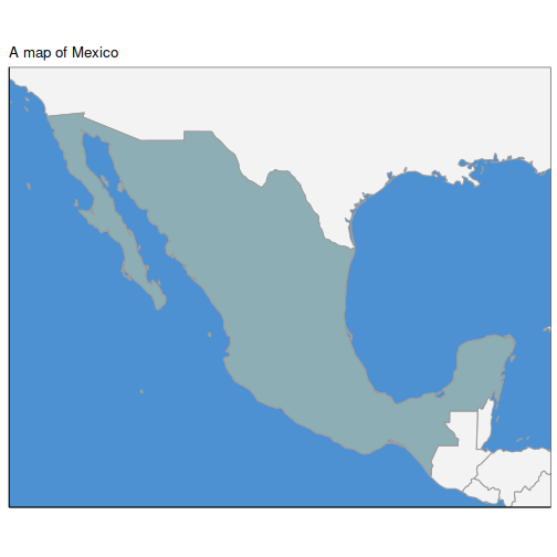
my_country_prev("Mexico", map_colors, x_limits = c(-118, -86), y_limits = c(14, 34)) +
  ggtitle("A map of Mexico")
Or we could do the same by creating a function and returning the title inside a list.
my_title <- function(text) {
  return(list(ggtitle(text)))
}

my_country_prev("Mexico", map_colors, x_limits = c(-118, -86), y_limits = c(14, 34)) +
  my_title("The same map of Mexico")
With that in mind, we can do all the calculations we want and start adding the data in form of geoms and stats to the base map.
A map with growing dots per city
We started with something simple, adding the amount of organizations per city, as growing dots.
make_dots <- function(.df,
                      year,
                      map_colors,
                      column_names = list(
                        lat = "lat",
                        lon = "lon",
                        cities = "city",
                        start_year = "year",
                        end_year = NULL),
                      dot_size = 1) {
  require(dplyr)
  require(tidyr)
  require(stringr)

  ## Some error handling
  mandatory_cols <- c("lat", "lon", "cities", "start_year")
  if(!all(mandatory_cols %in% names(column_names))) {
    stop("Column names missing!")
  } else {
    if (!"end_year" %in% names(column_names)) {
      .df$final_year <- NA_real_
      column_names[["end_year"]] <- "final_year"
    }
  }

  ## Dots base size
  base_size <- 5
  dot_sizes <- c(0.5 * (base_size * dot_size),
                 1 * (base_size * dot_size),
                 2 * (base_size * dot_size),
                 3 * (base_size * dot_size),
                 4 * (base_size * dot_size),
                 5 * (base_size * dot_size),
                 7 * (base_size * dot_size),
                 8 * (base_size * dot_size),
                 9 * (base_size * dot_size))

  ## Data manipulation to be used in the map
  filt <- .df  %>%
    mutate(year_final = replace_na(!!sym(column_names$end_year), year + 1),
           city_name = str_to_sentence(!!sym(column_names$cities))) %>%
    filter(year_final > year & !!sym(column_names$start_year) <= year) %>%
    group_by(city_name) %>%
    summarise(x = median(!!sym(column_names$lon), na.rm = T),
              y = median(!!sym(column_names$lat), na.rm = T),
              n = n()) %>%
    mutate(dot_size = case_when(n == 1 ~ dot_sizes[1],
                                n >= 2 & n <= 5 ~ dot_sizes[2],
                                n >= 6 & n <= 10 ~ dot_sizes[3],
                                n >= 11 & n <= 30 ~ dot_sizes[4],
                                n >= 31 & n <= 50 ~ dot_sizes[5],
                                n >= 51 & n <= 100 ~ dot_sizes[6],
                                n >= 101 & n <= 200 ~ dot_sizes[7],
                                n >= 201 & n <= 300 ~ dot_sizes[8],
                                n >= 301 ~ dot_sizes[9],
                                TRUE ~ NA))

  ## -------------------------- MAIN MAP ----------------------------------
  map_points <- list(
    geom_point(data = filt,
               aes(x, y, size = dot_size),
               color = map_colors$dots_orgs,
               alpha = 7/10,
               shape = 19) ,
    scale_size_identity('',
                        breaks = dot_sizes,
                        labels = c('1', '2-5', '6-10', '11-30', '31-50',
                                   '51-100', '101-200', '201-300', '>300'),
                        guide = guide_legend(label.position = 'bottom',
                                             label.vjust = 0,
                                             nrow = 1)),
    geom_point(data = filter(filt, n == 1),
               aes(x, y),
               color = map_colors$dots_orgs,
               shape = 19,
               size = 2.5) ,
    theme(legend.position = 'bottom')
  )

  return(map_points)
}
As you can see, the function also requires our object map_colors, which we created before. Another way of passing values from a list is by defining these values directly within the function arguments, as we did here for column_names. We could pass the arguments directly when calling the function, or define them earlier to be used. Let's use the second approach.
col_names = list(lat = "lat",
                 lon = "lon",
                 cities = "City",
                 start_year = "Registration_year")
If you look at the data frame that we created containing the data, this are simply the names of the columns as we specified them.
Now, about the function itself, it starts, as expected, by calling the libraries and then doing a bit of error handling to ensure that the fields that are strictly required are actually present in the data frame. There I am also adding the options for the end_year which is used in case some franchise closed and we want to map it only for the period of time it was present.
Then we define the "Dots base size". Here we experimented with so many sizes, both for the dots and for the final map, and this are the ones that look the best. Still, I'm allowing this value to be changed as the parameter dot_size in the function definition, however I wouldn't recommend changing it. You can also play with the internal values and see it for yourself. Since the idea here is to create functions for the "standards" of the maps, allowing minimal changes, we are not so strict as per how big the dots should be, yet we have certain degree of control.
Then we do a little bit of data manipulation before being able to use the data. This includes the standardization of the names of Cities (up to some degree), filtering the data that does not match with the selected year, using only the median value of the latitude and longitude data, and defining the sizes of the dots according to the amount of franchises. The last one is a tricky one that I haven't decided yet what amount of freedom should still be out there. Maybe there should be a separated function to define all that. Our maps were created to handle data containing from few hundreds of rows, to a couple of thousands, thus, the values presented here. But if you want to show just a few organizations (as is the case of this example), the map looks quite deserted; on the other hand, if you need to map values of thousands per city, the maps look overloaded. For the present post I'm keeping it as is, with a note for consideration. We also added one extra geom_point to overwrite the alpha value for the case of only 1, and make it solid. This also works well on the visuals.
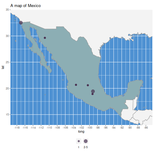
In any case, the function above shows how we can manipulate the data inside a function, and return only what we need to add it to an existent ggplot. We can now add the dots as we would normally do in ggplot style.
my_country_prev("Mexico",
                map_colors,
                 x_limits = c(-118, -86),
                 y_limits = c(14, 34),
                 show_coords = T) +
  make_dots(datmx,
            year = 2022,
            map_colors, column_names = col_names) +
  scale_x_continuous(n.breaks = 20) +
  ggtitle("A map of Mexico")
Adding labels for the map
Moving forward, we want to add some labels to the maps to know what we are seeing. Here I created one function to show which year is being mapped, and a second one to show the totals. Although we can achieve that easily in different ways, I managed to make it complicated, keeping in mind that we want to map any region in the world.
my_print_years <- function(year, map_colors, x_limits, y_limits, year_label = "Year") {

  ## POSITION FOR THE LABELS
  ## Starting points
  x_units <- abs(x_limits[1] - x_limits[2])/10
  y_units <- abs(y_limits[1] - y_limits[2])/10
  start_x <- min(x_limits)
  start_y <- min(y_limits)
  ## Frame
  rectangle.start.x <- start_x
  rectangle.wide <- rectangle.start.x + x_units
  rectangle.start.y <- start_y
  rectangle.high <- rectangle.start.y + y_units
  ## Text
  num.size <- 4
  text.size <- 3
  num.position.x <- start_x + (x_units * 0.5)
  text.position.x <- start_x + (x_units * 0.5)
  num.position.y <- start_y + (y_units * 0.25)
  text.position.y <- start_y + (y_units * 0.65)

  ## Adding the ggplot geoms
  pyears <- list(
    geom_rect(
      aes(xmin = rectangle.start.x, xmax = rectangle.wide,
          ymin = rectangle.start.y, ymax = rectangle.high),
      color = map_colors$text_legend,
      fill = map_colors$text_legend,
      alpha = 9/10),
    geom_text(
      aes(x = num.position.x,
          y = num.position.y,
          label = year),
      size = num.size,
      fontface = 'bold',
      color = map_colors$background_legend),
    geom_text(
      aes(x = text.position.x,
          y = text.position.y,
          label = year_label),
      size = text.size,
      fontface = 'bold',
      alpha = 9/10,
      color = map_colors$background_legend)
  )
  return(pyears)
}
Consider this some kind of snippet to add the labels wherever you want, and in any size you want. Our function is basically doing some basic simple calculations to place the labelling inside the map area, on the bottom-left corner. The first part with the comment ## POSITION FOR THE LABELS shows the basic calculations to do that, based on the coords, which should be the same as the coords specified in the map function. The calculations and the position are very stiff in size and location, but they will work the same regardless of the region mapped. On the other hand, it provides the basis for the function. Feel free to play with them to add custom options such as selecting the sizes or the corner where we want to display them.
The rest of the code is intuitive, geom_text to add the info we want to show, one for the word "Year" and another one for the numeric value. We add the corresponding values to the aes, the sizes, some alpha for transparency and our colors defined in map_colors.
my_print_totals <- function(totals, map_colors, x_limits, y_limits, totals_label = "Totals") {
  ## POSITION FOR THE LABELS
  ## Starting points
  x_units <- abs(x_limits[1] - x_limits[2])/10
  y_units <- abs(y_limits[1] - y_limits[2])/10
  start_x <- min(x_limits) + x_units
  start_y <- min(y_limits)
  ## Frame
  rectangle.start.x <- start_x
  rectangle.wide <- rectangle.start.x + x_units
  rectangle.start.y <- start_y
  rectangle.high <- rectangle.start.y + y_units
  ## Text
  num.size <- 4
  text.size <- 3
  num.position.x <- start_x + (x_units*0.5)
  text.position.x <- start_x + (x_units*0.5)
  num.position.y <- start_y + (y_units*0.25)
  text.position.y <- start_y + (y_units*0.65)

    ptotals <- list(
        geom_rect(aes(xmin = rectangle.start.x, xmax = rectangle.wide,
                      ymin = rectangle.start.y, ymax = rectangle.high),
                  color = '#283151',
                  fill = map_colors$background_legend,
                  alpha = 9/10),
        geom_text(
            aes(x = num.position.x, y = num.position.y,
                label = totals),
            size = num.size,
            fontface = 'bold',
            alpha = 9/10,
            color = map_colors$text_legend),
        geom_text(
            aes(x = text.position.x, y = text.position.y,
                label = totals_label),
            size = text.size,
            fontface = 'bold',
            alpha = 9/10,
            color = map_colors$text_legend)
    )
    return(ptotals)
}
We can follow exactly the same approach for the totals, to place them right next to the year. For now we have to specify the value of the total that we want to be shown, but this actually should be calculated by the function. Actually, if you think about it, we are passing a great deal of information that should be coming from the previous functions, and we should keep here arguments that control the visuals of the labels only. That is not an easy topic and I decided to cover it in a separated post. Another reason why I don't want to show it yet is because I haven't decided yet which approach I want to use.
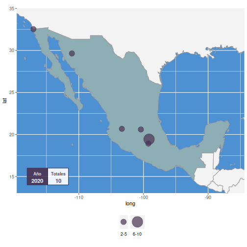
So, for now we have to pass each argument to each function and make sure that we are passing the same argument, but that is easy to achieve in R by directing the values to an object before passing it to the functions. Let's see it in action.
The dataset has already been stored in datmx and the colors in map_colors. Now we need to define a few more.
x_coords <- c(-118, -86)
y_coords <- c(14, 34)
yr <- 2020
totals <- 10
my_country_prev("Mexico",
                map_colors,
                x_coords,
                y_coords,
                show_coords = T) +
  make_dots(rbind(datmx, datmx),
            map_colors,
            year = yr,
            col_names) +
  my_print_years(yr, map_colors, x_coords, y_coords, "Año") +
  my_print_totals(totals, map_colors, x_coords, y_coords, "Totales")
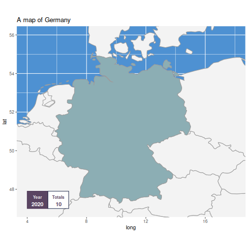
And there it is. Since my map is for Mexico, I am adding labels in Spanish. Feel free to test it in your own language and with more data. We can also have a look at how the labels fit to other countries, for example, smaller and bigger compared to Mexico.
x_coords <- c(4, 18)
y_coords <- c(47, 56)
my_country_prev("Germany",
                map_colors,
                 x_coords, y_coords,
                 show_coords = T) +
  my_print_years(yr, map_colors, x_coords, y_coords) +
  my_print_totals(totals, map_colors, x_coords, y_coords) +
  ggtitle("A map of Germany")
Germany is also looking good. And since we have the possibility of passing the values for year and totals, we don't actually need to have any data to test it, although the info shown is incorrect.
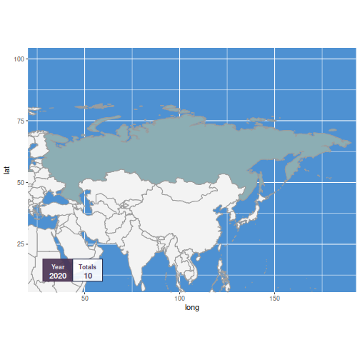
x_coords <- c(28, 185)
y_coords <- c(10, 100)
my_country_prev("Russia",
                map_colors,
                 x_coords, y_coords,
                 show_coords = T) +
  my_print_years(yr, map_colors, x_coords, y_coords) +
  my_print_totals(totals, map_colors, x_coords, y_coords)
Russia is a very particular case because the country is quite long but not so wide. If we specify coordinates too narrow for latitude, the map does not look good and the labels start getting deformed. It would be the same case with Chile, if we make it narrow in longitude but it is naturally long in latitude. Since the main aim of the functions is to take care of the aesthetics and visualization, we have to ensure that this should not happen, somehow. Having certain degree of the labels is one way to do that. We will see a few more in the future.
Conclusions
If your aim is only to make maps like the above for any given country, our first 3 posts should have you covered. We could also import our functions to a shiny app and work with that. However, there are many improvements that we can still do.
Now that we know the basis for functional programming with ggplot2, we can extend the power of our functions in the way how they share arguments by exploring the OOP (Object Oriented Programming) in R, the ggproto system to extend ggplot, and the use of environments.
Since we want the maps to be dynamic in time, we could also work on a couple of functions to cover that. It could easily be achieved in a for loop, which is perfectly fine. We could also use the apply family of functions or the map family of functions from the purrr package (not to be confused with geographic maps or the package maps). The last options could be a bit of complication because of the excess of arguments in our functions. That only shows that it is worth it to still improve them.
The next posts will be focused on this topic, so stay connected if you are interested on how I tackle these challenges.
